Smart Color Contrast Checker
Understanding color contrast is essential for building accessible, readable, and professional digital interfaces. Poor contrast can significantly reduce usability, especially for users with visual impairments or different vision conditions. The ULTRA PRO Contrast Studio helps designers and developers instantly analyze text and background combinations according to WCAG accessibility standards.
With this interactive tool, you can select any text color and background color, instantly calculate the contrast ratio, and check whether it meets AA or AAA compliance levels. The tool also simulates different types of color vision such as protanopia, deuteranopia, and tritanopia, helping you design for real-world accessibility scenarios.
Whether you're designing websites, mobile apps, dashboards, or UI components, ULTRA PRO Contrast Studio ensures your interface remains clear, accessible, and user-friendly. It also provides smart AI suggestions and automatic color fixes to help you reach compliance faster without manual adjustments.
How to Use
- Select your text color using the color picker.
- Select your background color for comparison.
- Choose your target accessibility level: AA (4.5) or AAA (7).
- Enable vision simulation mode to preview how users with color blindness will see your design.
- Use Ultra Auto Fix to automatically generate a compliant contrast combination.
- Save your best combinations for future use with Save Project.
Tips / Guide
- Always aim for at least AA compliance for standard accessibility.
- Use AAA level for high-readability interfaces such as dashboards and apps.
- Test multiple background variations before finalizing a UI color system.
- Use vision simulation modes to ensure accessibility for all users.
- Rely on auto-suggestions to quickly discover better contrast combinations.
Why It Matters
Color contrast directly impacts usability, readability, and accessibility. Poor contrast can make interfaces difficult or impossible to use for people with visual impairments or in low-light conditions. Ensuring proper contrast not only improves user experience but also helps meet WCAG accessibility standards, reducing legal and design risks while increasing product quality.
Who Should Use This Tool
- UI/UX designers building accessible interfaces.
- Frontend developers implementing design systems.
- Product teams ensuring WCAG compliance.
- Agencies and startups designing SaaS products.
- Anyone working with digital content, websites, or mobile apps.
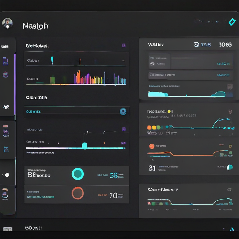
🚀 ULTRA PRO Contrast Studio + Projects
AI Suggestions
Common Mistakes (VC Mode Insights)
-
Ignoring measurable contrast metrics
Many teams rely on “visual feel” instead of validating WCAG ratios, which leads to hidden accessibility failures in production.
Impact: High risk of non-compliance in enterprise or government-ready products. -
Designing without accessibility-first thinking
Contrast decisions are often made late in the design process instead of being part of the design system foundation.
Impact: Expensive redesigns and inconsistent UI systems. -
Overusing aesthetic low-contrast styles
Modern “minimal UI” trends often sacrifice readability for visual elegance.
Impact: Reduced engagement and poor user retention on real-world devices. -
Ignoring vision deficiency scenarios
Products are rarely tested under protanopia, deuteranopia, or tritanopia simulation modes.
Impact: Up to 8–10% of users may experience degraded usability. -
Not standardizing contrast in design systems
Teams apply inconsistent color rules across components instead of enforcing a unified accessibility scale.
Impact: Technical debt in UI systems and scaling issues in large products. -
No automated validation layer
Lack of real-time contrast checking in design or development pipelines.
Impact: Accessibility issues discovered too late in QA or after release.
FAQs & Tips
-
It analyzes color combinations and checks whether they meet WCAG contrast standards for readable and accessible UI design.
-
For normal text, at least 4.5:1 is recommended (WCAG AA). For high accessibility (AAA), 7:1 or higher is preferred.
-
Yes, this tool is designed for real-world UI/UX work including dashboards, SaaS apps, websites, and mobile interfaces.
-
Yes, you can test both light and dark backgrounds to ensure accessibility across themes and user preferences.
-
Good contrast improves readability, reduces eye strain, and ensures your UI is accessible for users with visual impairments.
-
Yes, it can suggest improved color alternatives that increase contrast and meet accessibility standards instantly.
Advanced FAQs & Pro Design Tips
-
The recommended minimum is 4.5:1 for standard text and 3:1 for large text according to WCAG accessibility guidelines.
-
Proper contrast ensures readability for all users, including those with visual impairments or color blindness, improving overall accessibility.
-
Yes, but only if their luminance difference is high enough. Colors can look similar but still meet accessibility standards mathematically.
-
Always test contrast on actual UI components (buttons, text overlays) rather than isolated color swatches for more accurate results.
-
Indirectly yes. Bold text can improve readability, but it does not replace the need for proper color contrast ratios.
-
It means designing UI that remains distinguishable across different types of color vision deficiencies using contrast, shape, and labeling.
-
Because WCAG focuses on readability, not aesthetics. A combination can be accessible but still visually unappealing.
-
Start with brand colors, then validate contrast ratios, adjust brightness, and finally test in real UI components.
-
The same WCAG rules apply, but dark mode often requires higher luminance differences to maintain readability.
-
No. It speeds up analysis, but real-world usability testing with users is still essential for full accessibility validation.
Similar Tools You May Like
🎨 Color Contrast Checker
Check WCAG contrast ratios and improve accessibility in your UI designs.

🎨 Advanced Color Palette
Create balanced color palettes optimized for UI and accessibility.

🌈 Gradient Background Generator
Generate smooth gradients with perfect color harmony for modern UI.
🌈 Text Gradient Generator
Design stylish gradient text effects for headers and UI elements.
🪟 Glassmorphism Generator
Create modern glass UI effects with blur and transparency control.
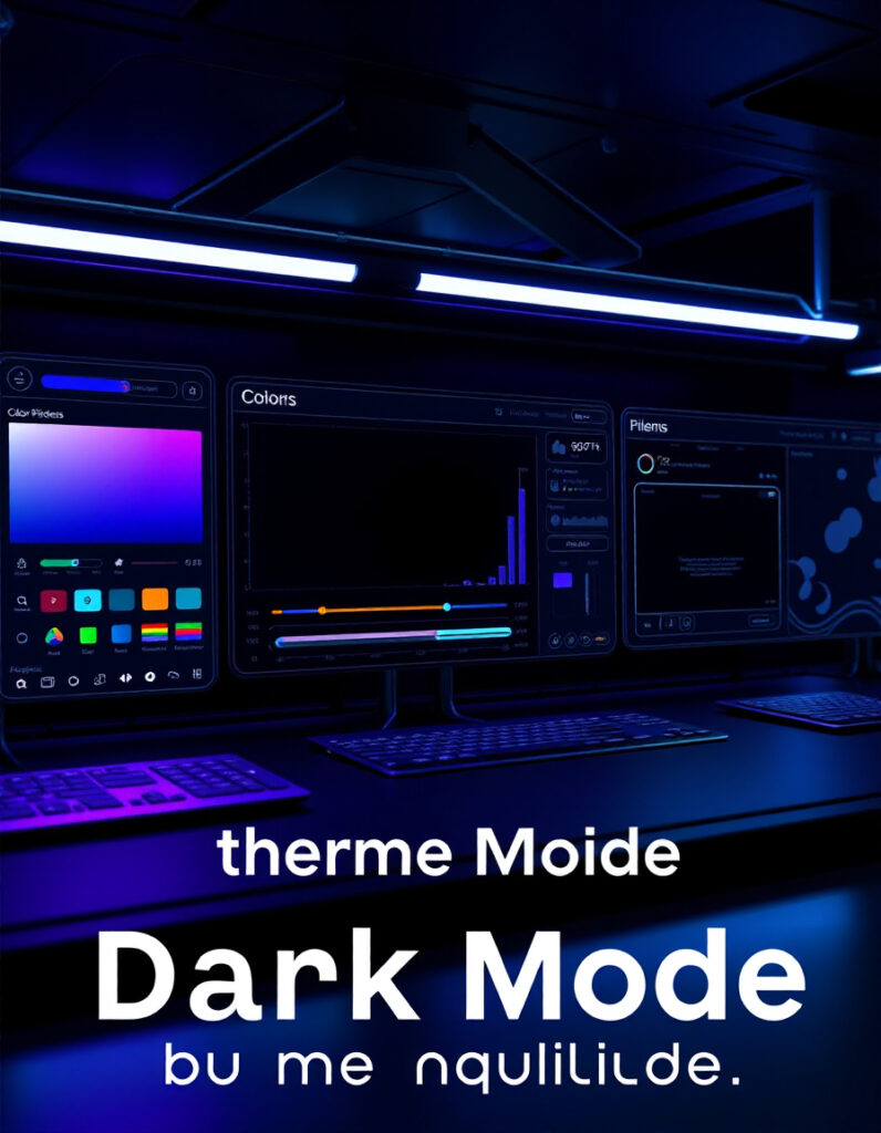
🌙 Dark Mode Theme Builder
Build accessible dark mode themes with optimized contrast control.
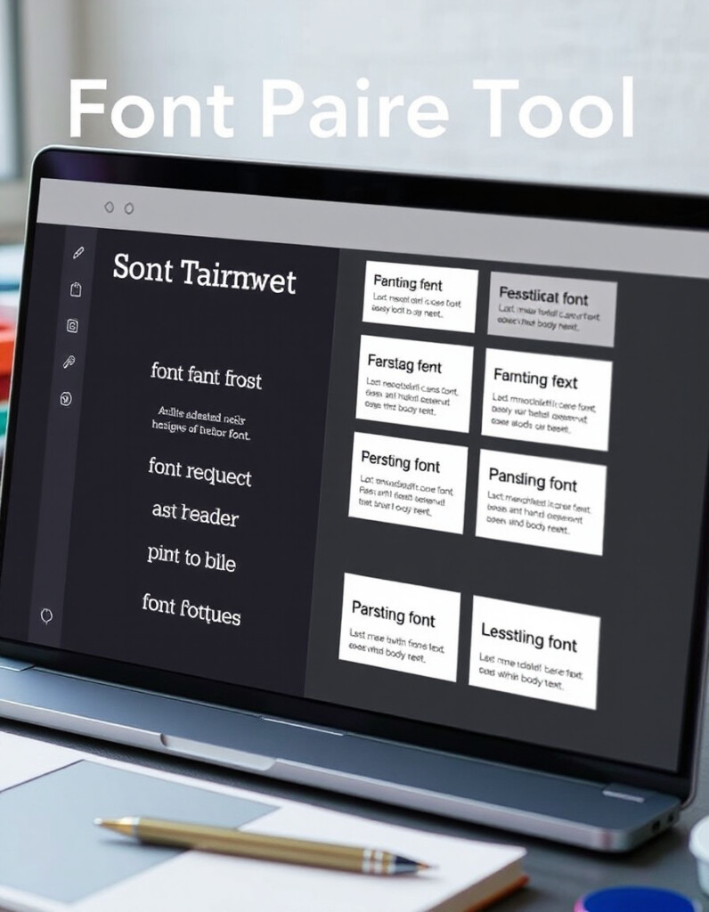
🔤 Font Pairing Tool
Find perfect font combinations that improve readability and design harmony.
📏 Spacing Scale Generator
Create consistent spacing systems for clean and accessible UI layouts.
🔧 Similar Tools
This tool is part of the educational resources published on RideWattly. Results should be used as a reference only and not as professional engineering advice.