rideWattly
CSS Mask Generator
Light Mode
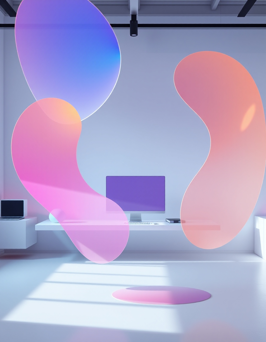
Create custom CSS masks effortlessly for your web design projects. With RideWattly’s CSS Mask Generator, you can design unique shapes, patterns, and gradients, apply them live to images, and instantly get the resulting CSS code.
This tool is perfect for UI designers, front-end developers, and creative coders. Experiment with linear, radial, and conic gradients, adjust color stops, angles, and opacity, and see your mask applied in real time on any image.
Whether you want to mask a hero image, create stylish buttons, or add complex visual effects to your web components, the CSS Mask Generator provides a fast, interactive, and intuitive interface to bring your designs to life.
Upload an image or paste a URL. Apply masks live to preview and copy CSS.
Advanced FAQs & Tips
-
Q: How do I create smooth gradient masks?
A: Use multiple color stops with gradual transitions. For linear gradients, adjust the angle carefully. For radial/conic, position stops evenly for smooth fading effects. -
Q: Can I combine multiple mask effects?
A: Yes, you can layer masks using CSSmask-imagewith multiple gradients or combine withclip-pathfor complex shapes. -
Q: How do I preview subtle transparency or blending?
A: Use RGBA colors for stops to control transparency. The preview updates live, so adjust opacity to see how it blends with the background. -
Q: How can I optimize masks for performance?
A: Keep gradients simple and avoid too many stops. Mask layers with high resolution images can be GPU-intensive. -
Q: Can I save and reuse my custom masks?
A: Yes, copy the generated CSS and store it in your project. You can also embed the tool and recreate presets manually. -
Q: How do I ensure compatibility across browsers?
A: Use vendor prefixes like-webkit-mask-imagefor WebKit browsers and test the mask on Chrome, Safari, and Firefox.
FAQs & CSS Examples
-
Q: How do I create a linear gradient mask?
A:.preview-img { -webkit-mask-image: linear-gradient(180deg, rgba(0,0,0,1) 0%, rgba(0,0,0,0) 100%); mask-image: linear-gradient(180deg, rgba(0,0,0,1) 0%, rgba(0,0,0,0) 100%); } -
Q: How do I create a radial gradient mask?
A:.preview-img { -webkit-mask-image: radial-gradient(circle at center, rgba(0,0,0,1) 50%, rgba(0,0,0,0) 100%); mask-image: radial-gradient(circle at center, rgba(0,0,0,1) 50%, rgba(0,0,0,0) 100%); } -
Q: How do I create a conic gradient mask?
A:.preview-img { -webkit-mask-image: conic-gradient(from 0deg, rgba(0,0,0,1) 0deg, rgba(0,0,0,0) 360deg); mask-image: conic-gradient(from 0deg, rgba(0,0,0,1) 0deg, rgba(0,0,0,0) 360deg); } -
Q: How do I layer multiple masks?
A:.preview-img { -webkit-mask-image: linear-gradient(180deg, rgba(0,0,0,1) 0%, rgba(0,0,0,0) 100%), radial-gradient(circle at center, rgba(0,0,0,1) 50%, rgba(0,0,0,0) 100%); mask-image: linear-gradient(180deg, rgba(0,0,0,1) 0%, rgba(0,0,0,0) 100%), radial-gradient(circle at center, rgba(0,0,0,1) 50%, rgba(0,0,0,0) 100%); } -
Q: How do I adjust transparency in masks?
A:.preview-img { -webkit-mask-image: linear-gradient(180deg, rgba(0,0,0,0.8) 0%, rgba(0,0,0,0) 100%); mask-image: linear-gradient(180deg, rgba(0,0,0,0.8) 0%, rgba(0,0,0,0) 100%); }
Related Tools & Resources
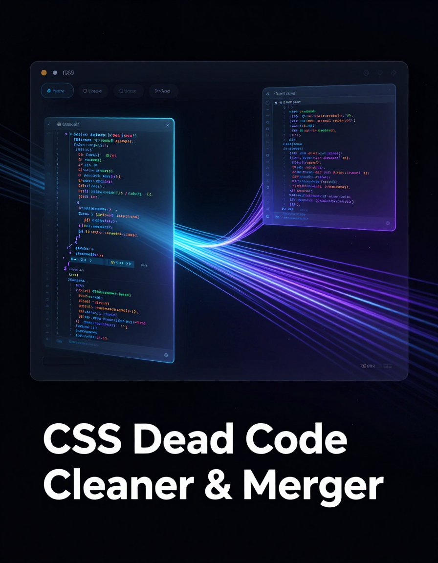
🧹️ CSS Duplicate Cleaner & Merger
Clean and merge redundant CSS code for cleaner stylesheets.

🌙️ Light-to-Dark CSS Generator
Convert your light theme CSS to dark mode effortlessly.

🛠️ Interactive CSS Enhancer
Add live CSS effects and dark mode toggles to your web projects.
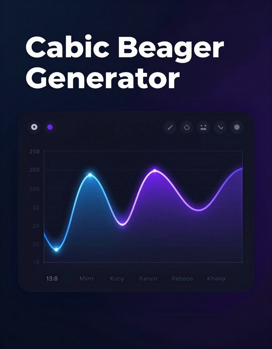
🎛️ Cubic Bezier Generator
Design and preview smooth CSS animations with precision timing.
🖼️️ CSS Mask Generator
Create custom CSS masks and gradients live for your web elements.

📐 CSS Shape Builder
Build triangles, arrows, ribbons, and other CSS shapes easily.
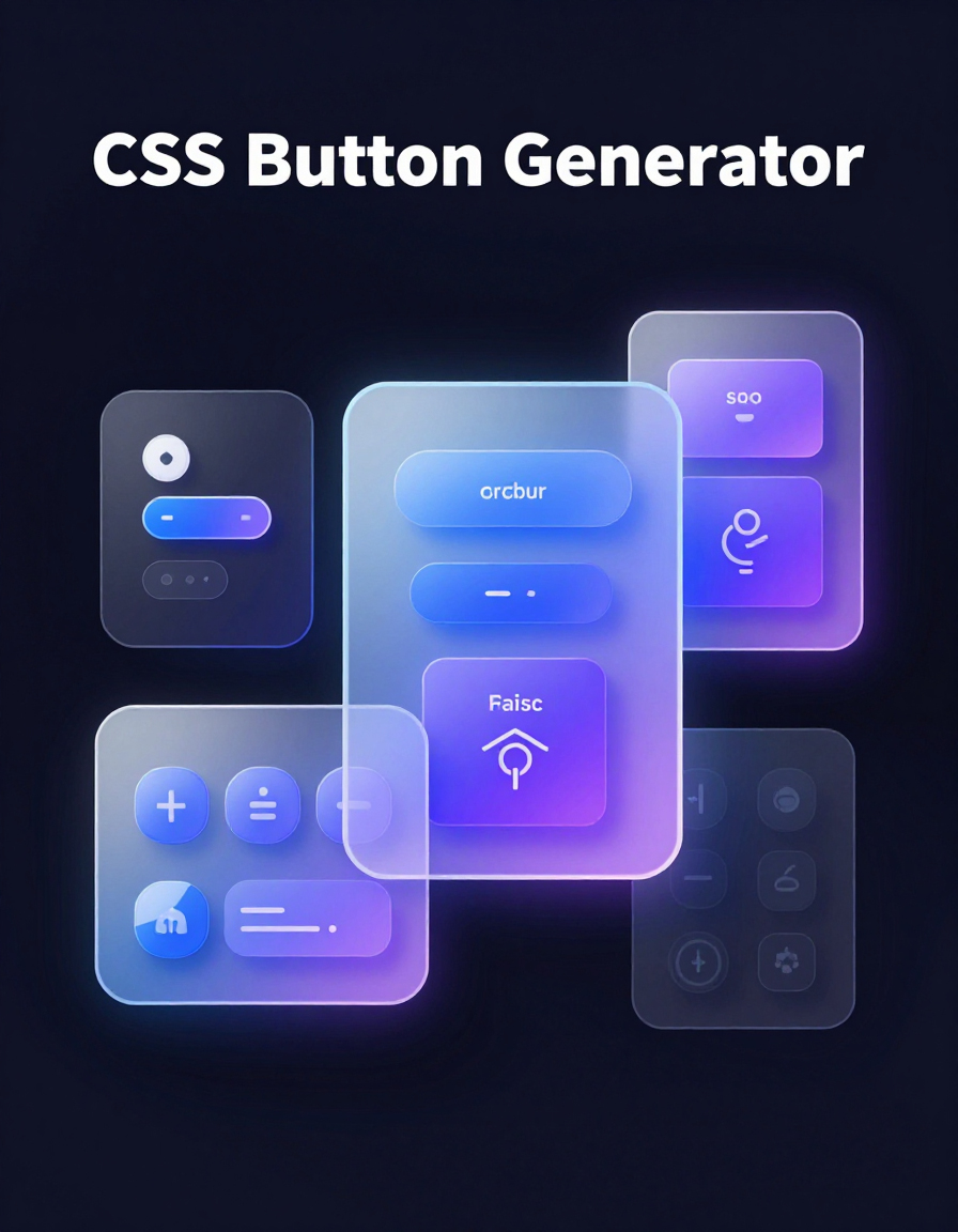
🔘 CSS Button Generator
Create stylish buttons with gradients, shadows, and hover effects for your web projects.
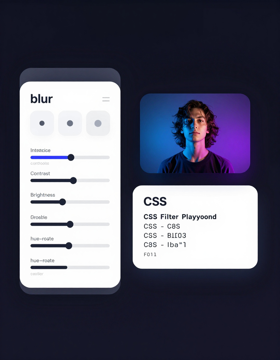
🎨 CSS Filter Playground
Experiment with CSS filters like blur, brightness, contrast, and more on images and elements.
🔧 Similar Tools
This tool is part of the educational resources published on RideWattly. Results should be used as a reference only and not as professional engineering advice.