Dark Mode Theme Builder Pro
Dark Mode Theme Builder Pro
Build perfectly synchronized Light & Dark UI themes with intelligent contrast mapping, accessible color harmony, and instant CSS export.
Saved Themes
Live Preview H2
Live Preview H3
This is regular text.
This is secondary text example.
Accent linkRelated Tools & Resources

🌙 Light-to-Dark CSS Generator
Automatically convert light themes into balanced dark mode CSS variables.

🎨 Advanced Color Palette
Create harmonious UI color systems for modern web applications.

🎯 Color Contrast Checker
Test WCAG accessibility compliance for light and dark themes.

🌈 Gradient Background Generator
Design smooth modern gradients for hero sections and UI backgrounds.
🪟 Glassmorphism Generator
Create layered glass UI effects that work beautifully in dark mode.
🔤 Typography Scale Generator
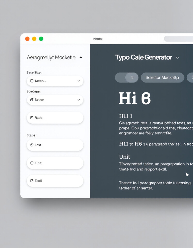
Build scalable typography systems optimized for both light and dark interfaces.
🔧 Similar Tools
Why Dark Mode Matters
Dark mode is no longer just a visual trend — it’s a UX standard. Modern users expect interfaces to adapt to lighting conditions, reduce eye strain, and maintain visual comfort during extended screen time.
Studies in human–computer interaction show that lower luminance interfaces can reduce perceived glare in low-light environments and improve focus by minimizing visual noise. When implemented correctly, dark mode enhances content hierarchy and accent contrast.
However, poor dark theme design can reduce readability, flatten depth perception, and cause accessibility failures. That’s why intelligent color synchronization — not simple inversion — is essential for professional UI systems.
- Reduced Eye Fatigue in low-light environments
- Improved Focus through controlled contrast hierarchy
- Battery Efficiency on OLED and AMOLED displays
- Modern UX Expectation across apps and SaaS platforms
- Accessibility Support when contrast ratios are properly balanced
With the right balance of background depth, text luminance, and accent vibrancy, dark mode becomes a powerful design asset — not just an aesthetic toggle.
This tool is part of the educational resources published on RideWattly. Results should be used as a reference only and not as professional engineering advice.