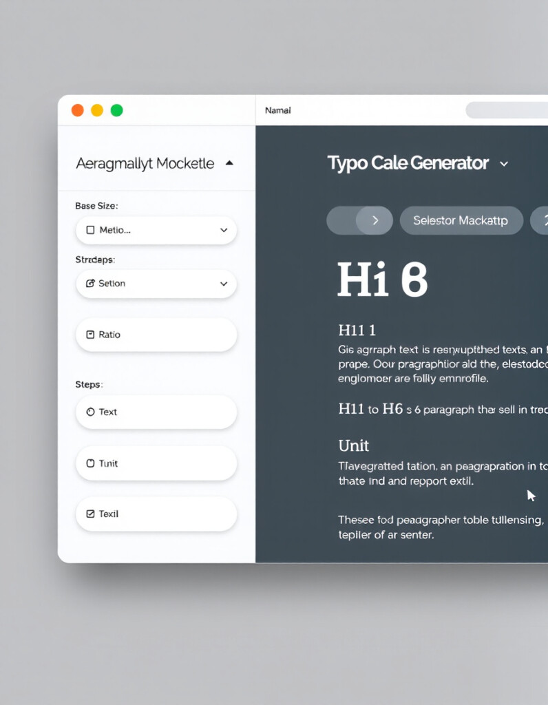
Typography Scale Generator
Typography is one of the most important parts of modern web design. Great spacing, clean hierarchy, and readable text can completely transform a website’s aesthetic and usability. The RideWattly Typography Scale Generator helps you create a perfectly balanced modular type scale — without guessing, without design tools, and without manually recalculating font sizes every time.
How to Use the Typography Scale Generator (Guide + Benefits)
This guide walks you through how to use the generator, what each option means, and why a modular scale is essential for professional UI design.
What the Tool Does
The Typography Scale Generator automatically creates:
- A complete typographic scale for H1–H6, paragraph, and small text
- CSS
:rootvariables for all generated sizes - Optional SCSS maps
- A live preview that updates in real time
- Downloadable
.cssfile - Copy-ready CSS and HTML samples
In other words — it builds an entire typography system for you, fully responsive and consistent.
How to Use the Generator
1. Set the Base Font Size
You can start with a standard 16px, but any value works.
For clean responsive typography, choose between:
- px – precise control
- rem – accessibility-friendly & scalable
This base defines the smallest step in your scale.
2. Choose a Ratio
The ratio determines the mathematical progression of your scale.
Common choices include:
- 1.125 – Minor Third (subtle & elegant)
- 1.25 – Major Third (balanced & versatile)
- 1.333 – Perfect Fourth (bold, strong headings)
- 1.618 – Golden Ratio (classic & expressive)
You can also type your own custom value for full control.
3. Select the Number of Steps
This controls how many scale levels are created.
More steps = larger difference between body text and headings.
The tool automatically maps the highest values to:
- h1 → largest
- h2 → slightly smaller
- …
- h6 → near-body size
And paragraphs + small text map to the lowest step.
4. Choose the Output Format
You can export:
- CSS :root variables + utility classes
- SCSS map
Both options include heading classes, paragraph sizing, and small text scaling.
5. View the Live Preview
As you change settings, the right side of the screen updates instantly:
- Headings h1–h6
- Paragraphs
- Small text
You can visually compare the hierarchy before exporting the code.
Why Use a Typography Scale?
Professional designers and UI systems (Material Design, Tailwind, Bootstrap, Shopify Polaris) all rely on modular scales.
Here’s why:
✔ Consistency Across the Entire Website
Every heading, label, and paragraph follows the same rhythm.
No random sizes, no accidental mismatches.
✔ Improved Readability
Well-structured text improves user experience, SEO, and accessibility.
✔ Faster Design & Development
Developers don’t need to choose new font sizes every time.
They use:
✔ Perfect Visual Hierarchy
Each step feels naturally proportional to the next — no guessing.
✔ Scalable & Future-Proof
Change one ratio → entire site adjusts automatically.
Who Is This Tool For?
- Web designers
- Developers
- Content creators
- UI/UX designers
- Anyone building clean, modern websites
Whether you’re designing a landing page or a full design system, this tool gives you a foundation that looks professional immediately.


