Flexbox Generator (Full Persistence & Max Items Per Row)

Creating responsive layouts with CSS Flexbox can be powerful but sometimes confusing. Developers often need to test different combinations of flex-direction, alignment, wrapping, and spacing to understand how elements behave across rows and columns.
The RideWattly Flexbox Generator provides an interactive environment where you can visually build and test modern layouts. Adjust container settings such as justify-content, align-items, flex-wrap, and item count while instantly seeing how the layout responds.
This tool also introduces advanced controls like maximum items per row, allowing you to simulate grid-like structures using pure Flexbox. Once your layout is ready, you can export clean CSS and integrate it directly into your project or UI prototype.
How CSS Flexbox Works
Flexbox (Flexible Box Layout) is a modern CSS layout system designed to arrange elements in rows or columns while automatically adapting to available space. It solves many common layout problems that were difficult with traditional CSS methods.
A Flexbox layout consists of two parts:
- Flex Container – the parent element using
display:flex - Flex Items – the child elements placed inside the container
Developers control layout behavior using properties such as flex-direction, justify-content, align-items, flex-wrap, flex-grow, and flex-shrink.
Using these properties together allows you to build highly responsive interfaces that automatically adapt to different screen sizes.
Common Flexbox Layout Examples
Flexbox is widely used in modern web design because it simplifies many layout patterns that previously required complex CSS.
- Navigation bars with evenly spaced menu items
- Responsive card layouts for product grids
- Centered content both vertically and horizontally
- Flexible columns that adapt to screen width
- Wrapping rows for responsive UI components
With the Flexbox Generator above you can experiment with different combinations of layout settings and instantly preview how items behave across rows and columns.
Flexbox vs CSS Grid
Both Flexbox and CSS Grid are powerful layout systems, but they are designed for different purposes.
- Flexbox works best for one-dimensional layouts (rows OR columns).
- CSS Grid is ideal for two-dimensional layouts (rows AND columns).
- Flexbox is often used for UI components such as navigation bars, buttons, and cards.
- Grid is commonly used for full page layouts and complex dashboard designs.
Many modern websites combine both systems — using Flexbox for components and Grid for page structure.
Flexbox Cheat Sheet
CSS Flexbox includes several key properties that control how elements behave inside a flexible container. The cheat sheet below summarizes the most commonly used settings.
- display: flex – enables Flexbox layout for the container
- flex-direction – defines the main axis (row, column)
- justify-content – controls horizontal distribution of items
- align-items – controls vertical alignment of items
- flex-wrap – determines whether items wrap to new rows
- gap – defines spacing between flex items
- flex-grow – allows items to expand to fill space
- flex-shrink – allows items to shrink when space is limited
The Flexbox Generator above lets you experiment with all these properties visually and generate production-ready CSS instantly.
Interactive Flexbox Layout Examples
Flexbox is one of the most powerful tools for building responsive interfaces. Here are several layout patterns commonly created with Flexbox:
- Centered layouts for landing pages and hero sections
- Responsive card grids for product or article listings
- Navigation bars with evenly spaced menu items
- Flexible columns that adapt to different screen sizes
- Wrapping galleries for images and UI components
Using the generator above you can instantly preview these layouts by adjusting direction, alignment, wrapping, and item count. This makes it easier to experiment before implementing layouts in real projects.
Common Flexbox Mistakes
Although Flexbox is powerful, many developers run into common layout issues when first using it. Understanding these mistakes can save time and prevent confusing behavior.
- Forgetting to set display:flex on the container
- Confusing justify-content and align-items
- Using Flexbox when CSS Grid would be better
- Not enabling flex-wrap when items overflow
- Incorrect flex-grow or flex-shrink values
The interactive preview in the Flexbox Generator helps you understand how each property affects layout behavior in real time.
FAQs & Tips
-
The Flexbox Generator lets you visually create CSS Flexbox layouts. You can adjust direction, alignment, wrapping, and item behavior while instantly seeing how the layout responds.
-
Flexbox is a CSS layout system used to arrange elements in rows or columns while automatically adapting to available space. It is commonly used for navigation bars, card layouts, responsive UI components, and modern web interfaces.
-
This setting limits how many items appear in each row of the flex container. It helps simulate grid-like layouts while still using Flexbox, making it easier to build responsive card or gallery layouts.
-
Justify-content controls alignment along the main axis (usually horizontal in row layouts), while align-items controls alignment along the cross axis (usually vertical). Together they determine how elements are positioned inside the container.
-
The flex-wrap property determines whether items stay on one line or wrap onto multiple rows when space becomes limited. Enabling wrapping is essential for building responsive layouts that adapt to smaller screens.
-
Yes. The tool generates clean CSS based on your settings. You can copy the CSS directly or download an HTML/CSS example to use in your project.
Advanced FAQs & Pro Tips
-
Flexbox works best for one-dimensional layouts such as rows of cards, navigation bars, or UI components. CSS Grid is usually better for complex two-dimensional page layouts with both rows and columns.
-
By default, Flexbox uses align-items: stretch. This causes items to expand to match the container’s cross-axis size. Changing the value to center, flex-start, or flex-end will stop the stretching behavior.
-
If flex-wrap: nowrap is used, all items stay on one line even if they overflow the container. Enabling wrap allows items to move onto new rows when space becomes limited.
-
The flex-grow property determines how much an item can expand relative to other items in the container. Items with higher grow values will take up more available space.
-
flex-shrink determines how items behave when there is not enough space in the container. Items with higher shrink values will reduce their size more aggressively.
-
Many modern websites use CSS Grid for overall page structure and Flexbox for internal components like cards, toolbars, or navigation menus.
-
Limiting the number of items per row helps simulate grid-like card layouts while still using Flexbox. This approach is useful for galleries, product listings, and UI dashboards.
-
Yes. The visual preview allows beginners to experiment with layout properties and immediately see how each setting changes the behavior of the container and items.
Related Tools & Resources

🔲 Grid Builder
Create responsive CSS Grid layouts visually and export clean production-ready code.
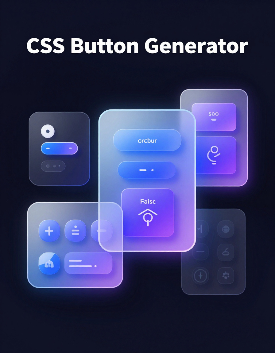
🔘 CSS Button Generator
Design modern CSS buttons with hover effects, shadows, and animations.

🌈 Gradient Background Generator
Create beautiful CSS gradients and export optimized background styles.

📏 Spacing Scale Generator
Generate consistent spacing systems for margins, padding, and layout rhythm.
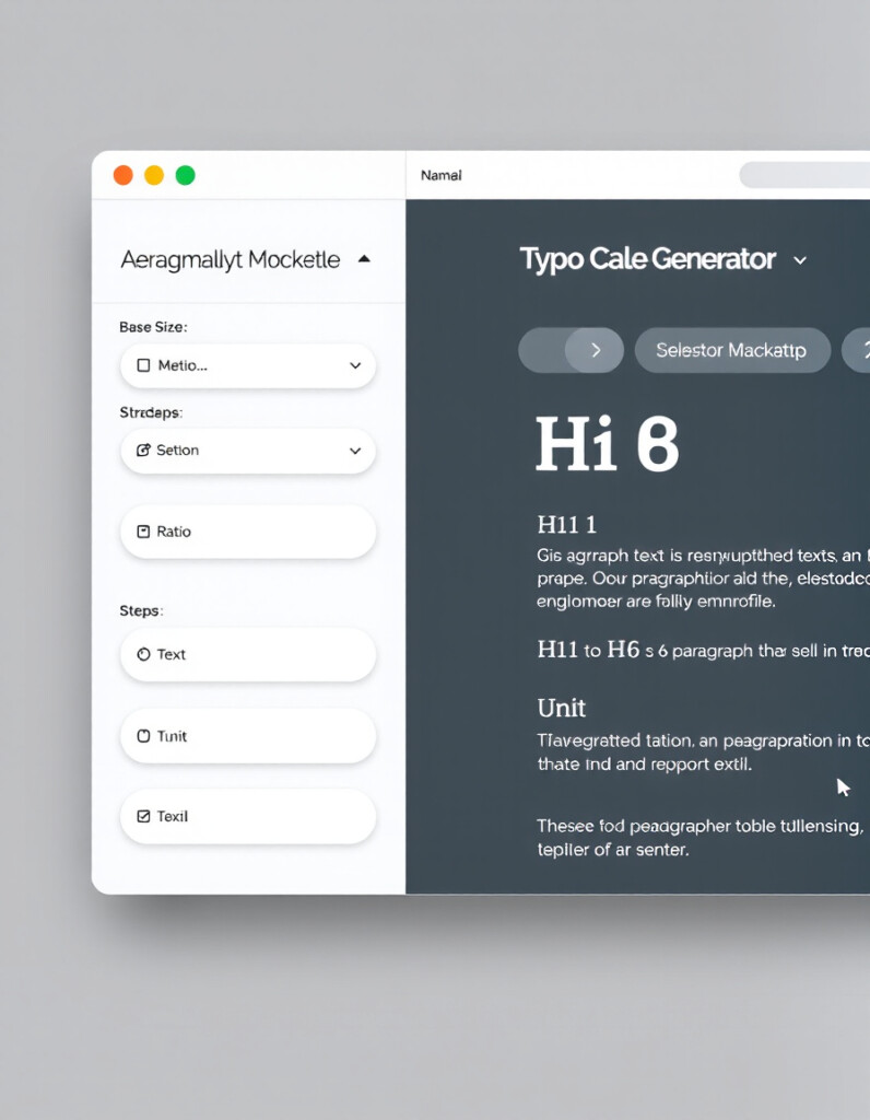
🔤 Typography Scale Generator
Build balanced typography scales for headings, UI text, and responsive layouts.
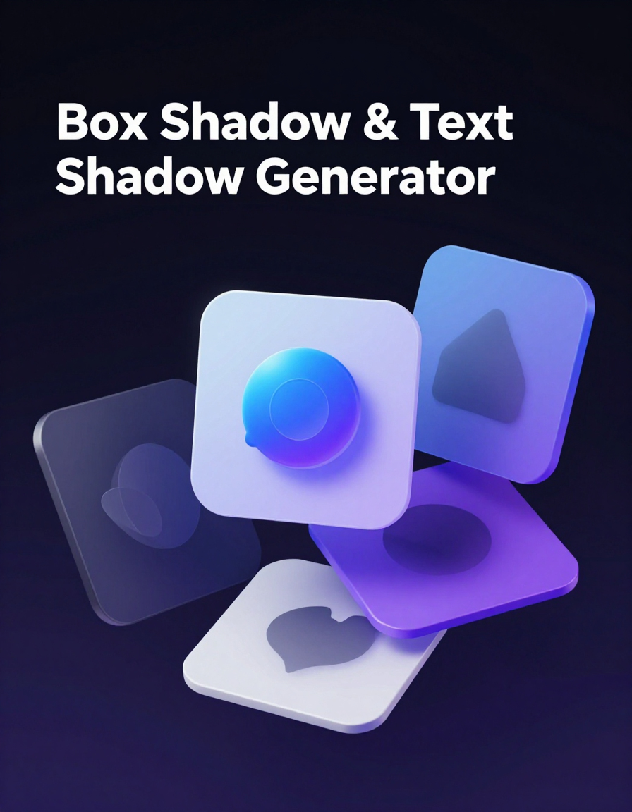
💨 Shadow Generator
Create smooth CSS box-shadows and text-shadows for modern UI elements.

🛠️ Interactive CSS Enhancer
Enhance CSS layouts with live previews and dark mode toggle functionality.
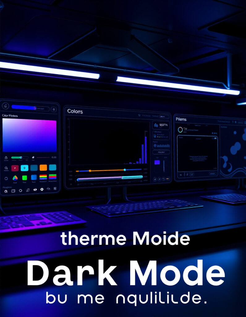
🌙 Dark Mode Theme Builder
Create dark mode themes for your site easily with live preview and ready-to-use CSS.
🔧 Similar Tools
This tool is part of the educational resources published on RideWattly. Results should be used as a reference only and not as professional engineering advice.