Advanced Color Palette
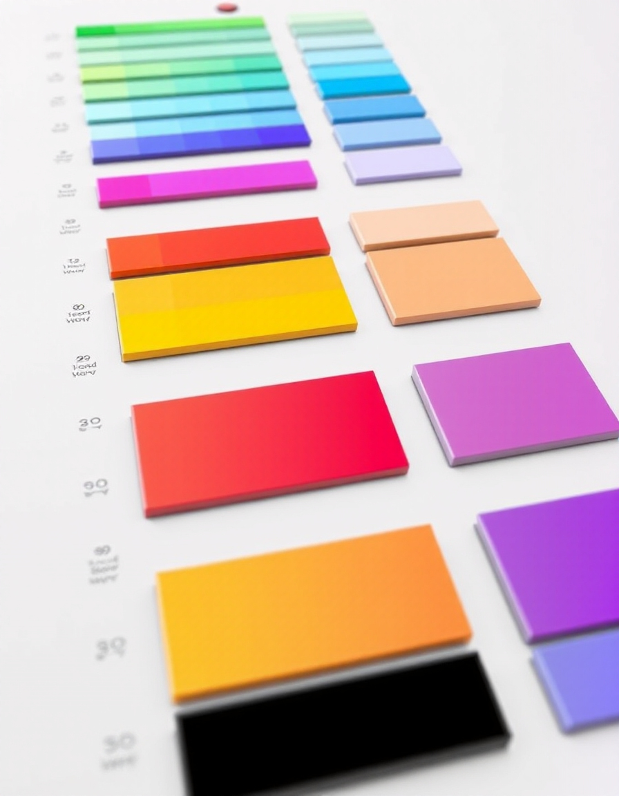
Choosing the right color palette is one of the most important steps in web design, branding, and UI creation. The right combination of colors can improve readability, guide user attention, and create a strong visual identity for your project.
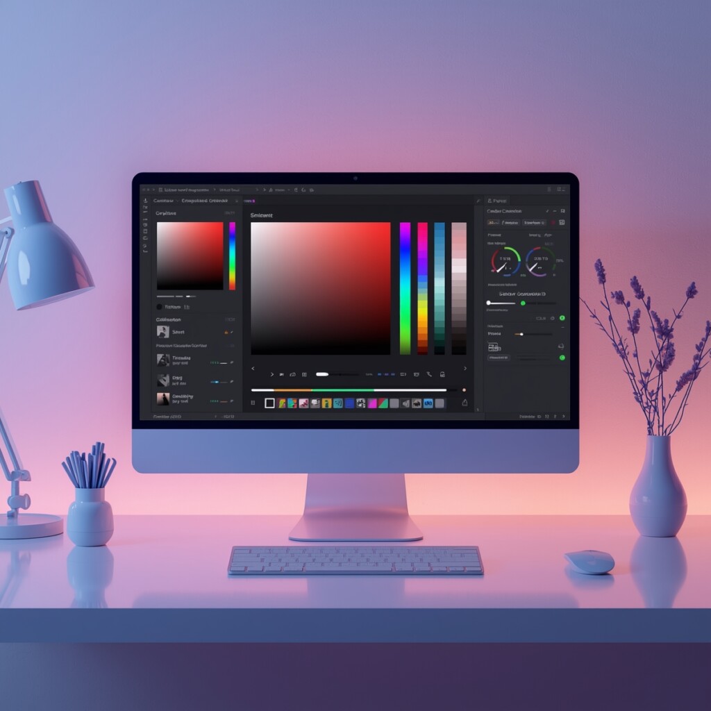
RideWattly’s Advanced Color Palette Generator helps designers, developers, and creators quickly build harmonious color schemes. You can generate palettes, add custom colors, experiment with HEX, RGB, HSL formats, and instantly preview how colors work together.
Whether you're designing a website interface, creating a brand identity, building a mobile UI, or experimenting with gradients and color harmony, this tool makes it easy to generate modern palettes ready for real design projects.

Design Tips for Using Colors Effectively
Good color choices can make or break a design. Use contrast to improve readability, accent colors to guide attention, and neutral palettes to balance strong tones. Experimenting with your palette in our generator helps visualize these tips instantly.
RideWattly’s tool allows you to test combinations, adjust saturation, brightness, and preview how multiple colors work together before implementing them in your UI or brand identity.

How Color Palettes Work
A color palette is more than just pretty colors. It defines relationships such as complementary, analogous, triadic colors to create visual harmony. Understanding these relationships ensures your design communicates the right mood and style.
With our generator, you can experiment with different palette types, preview gradients, and save harmonious combinations for your projects.
Popular Palette Types
Designers often rely on tried-and-true palette types. Monochrome palettes create subtle, elegant designs. Analogous palettes evoke harmony, while complementary palettes add striking contrast. Our tool supports all these types and lets you tweak them to suit your unique project.
Experiment with these palettes in real-time, copy HEX or CSS snippets, and integrate them directly into your website, app, or branding materials.
Your CSS snippet will appear here
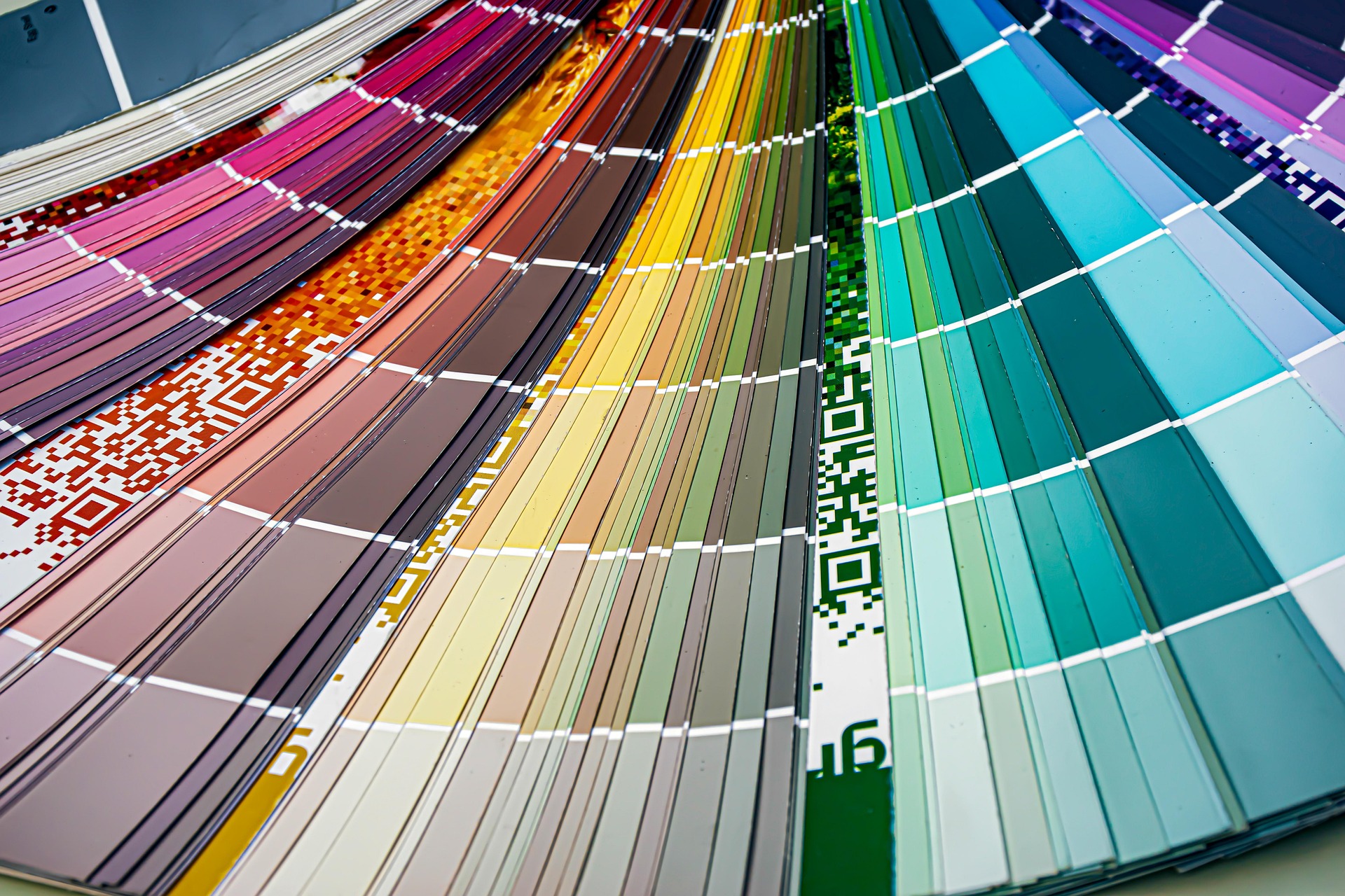
Best Color Palette Examples for Websites
Looking for inspiration? Below are some popular website color palettes used in modern UI design, branding, and landing pages. Each palette includes HEX codes you can easily copy and use in your project.
Modern Tech Palette
#0F172A • #3B82F6 • #22C55E • #F1F5F9
Startup Gradient Palette
#6D28D9 • #9333EA • #EC4899 • #F9FAFB
Minimal UI Palette
#111827 • #6B7280 • #E5E7EB • #FFFFFF
Nature Inspired Palette
#166534 • #4ADE80 • #FDE68A • #FEFCE8
Luxury Brand Palette
#111111 • #D4AF37 • #F5F5F5 • #9CA3AF
Playful App Palette
#F43F5E • #F59E0B • #10B981 • #3B82F6
Color Psychology in UI and Web Design
Colors influence how users feel and behave on websites and apps. Choosing the right palette can increase engagement, trust, and conversion rates. Below are common meanings of popular colors in digital design.
- Blue – Trust, technology, reliability. Used by many tech companies.
- Green – Nature, balance, sustainability. Popular for eco brands and finance apps.
- Red – Energy, urgency, action. Often used for buttons and promotions.
- Yellow – Optimism, creativity, attention.
- Purple – Luxury, creativity, imagination.
- Black – Elegance, minimalism, luxury branding.
Understanding color psychology helps designers create more effective user interfaces and brand identities.
How to Build the Perfect Color Palette
Creating a balanced color palette is an important step in modern UI and web design. Follow these simple steps to build a professional palette for your website or app.
-
Choose a Primary Color
Start with one dominant brand color that represents your product or company identity. -
Add Supporting Colors
Select 2–3 complementary colors that work well with the main color. -
Use Neutral Backgrounds
Add neutral colors like white, gray, or black to balance the design. -
Test Accessibility
Make sure your colors have enough contrast for readability and accessibility. -
Keep it Consistent
Use the same palette across your website, UI components, and branding materials.
Color Accessibility Tips for Better UI Design
Accessible color palettes ensure that all users, including those with visual impairments, can read and navigate your interface easily.
- Maintain strong contrast between text and background colors.
- Avoid relying only on color to communicate important information.
- Use accessible color combinations that meet WCAG contrast guidelines.
- Test your palette on different screens and lighting conditions.
- Use tools to verify accessibility before publishing your design.
Accessible design improves usability, SEO, and user satisfaction.
Popular Color Palette Types Used in Design
Designers often build color palettes using well-known color harmony rules. These palette types help create balanced and visually appealing designs for websites, apps, and branding projects.
Monochromatic Palette
A monochromatic palette uses different shades, tints, and tones of a single color. It creates a clean and minimal design that feels consistent and professional.
Analogous Palette
Analogous palettes use colors that sit next to each other on the color wheel, such as blue, teal, and green. This scheme produces smooth and harmonious designs.
Complementary Palette
Complementary colors sit opposite each other on the color wheel, such as blue and orange. This palette creates strong contrast and works well for call-to-action elements.
Triadic Palette
A triadic palette uses three evenly spaced colors on the color wheel. It creates vibrant and dynamic designs while maintaining color balance.
Split Complementary Palette
This palette combines one base color with the two colors adjacent to its complement. It offers strong contrast but feels less aggressive than a pure complementary scheme.
Tetradic Palette
A tetradic color scheme uses four colors arranged into two complementary pairs. It provides a rich and flexible palette suitable for complex designs.
FAQs & Tips
-
It helps designers and developers generate harmonious color palettes for websites, branding, and UI projects. You can combine colors, preview them together, and build balanced color schemes instantly.
-
The tool supports HEX, RGB, RGBA, HSL, HSLA, and standard color names. This flexibility allows you to experiment with colors in formats commonly used in web design and CSS styling.
-
Yes. The random palette feature instantly creates new color combinations. This is useful when you want creative inspiration or want to discover unexpected color harmonies.
-
Yes. The tool can generate a ready-to-use CSS snippet that you can copy and paste directly into your website stylesheets or UI design systems.
-
Professional designers usually combine a primary color, secondary colors, and accent colors. Good palettes also consider contrast, accessibility, and visual hierarchy to create balanced and readable interfaces.
-
Popular palette types include monochromatic palettes, analogous palettes, complementary palettes, and triadic color schemes. These combinations are based on color theory and help maintain visual harmony.
-
Yes. UI and UX designers often use palette generators to create consistent themes for apps, dashboards, and websites. A well-designed palette improves usability and visual clarity.
-
Absolutely. Color palettes are essential for branding. The generator helps explore combinations that work well for logos, marketing materials, and brand identity systems.
-
Yes. Choosing colors with proper contrast improves readability and accessibility for users, including people with visual impairments. Good palettes should follow accessibility guidelines such as WCAG contrast recommendations.
-
Yes. RideWattly provides this tool completely free for designers, developers, students, and anyone who wants to create modern color schemes quickly.
Advanced Color Palette Tips for Designers
-
Most professional palettes use 3 to 5 colors. A primary color defines the brand, two supporting colors add visual variety, and neutral colors help balance the design.
-
The 60-30-10 rule is a common design principle: 60% dominant color, 30% secondary color, and 10% accent color. This creates a balanced and visually pleasing composition.
-
Start with a primary brand color, then add complementary or analogous colors. Test your palette on UI components like buttons, backgrounds, and text to ensure good contrast and readability.
-
Modern interfaces often combine neutral backgrounds (white, gray, dark tones) with one strong accent color such as blue, purple, or green for interactive elements.
-
Use strong contrast between text and background colors. Accessibility guidelines recommend a contrast ratio of at least 4.5:1 for normal text.
-
Bright colors work well for accents and calls to action, while muted colors are better for backgrounds and large sections of UI.
-
Complementary colors sit opposite each other on the color wheel, such as blue and orange. They create strong visual contrast and are useful for highlighting important UI elements.
-
Yes. Color palette generators help designers quickly explore harmonious color combinations for logos, websites, apps, and brand identity systems.
-
Use one base color and vary its shades, tints, and tones. This creates a subtle, harmonious palette that’s easy on the eyes.
-
Analogous palettes use colors next to each other on the color wheel. They give a natural and pleasing look and work well for backgrounds and UI sections.
-
Check popular design resources and tools, and use the color generator to combine trending hues, like pastel gradients, neon accents, and muted earth tones.
Similar Tools You May Like

🎨 Ultimate Color Spectrum Explorer
Explore full color spectrums and create harmonized palettes for any project.

🎨 Advanced Color Palette
Generate professional palettes with ease and test contrast for accessibility.

🎨 Color Contrast Checker
Verify color combinations meet WCAG accessibility standards quickly.
🎨 Gradient Palette Generator
Create smooth gradients and matching color transitions for modern UI.
🌈 Text Gradient Generator
Apply dynamic gradient effects to text for headers and social media visuals.
🎨 Logo Uploader & Colorizer
Upload your logo and experiment with color variations to match your palette.
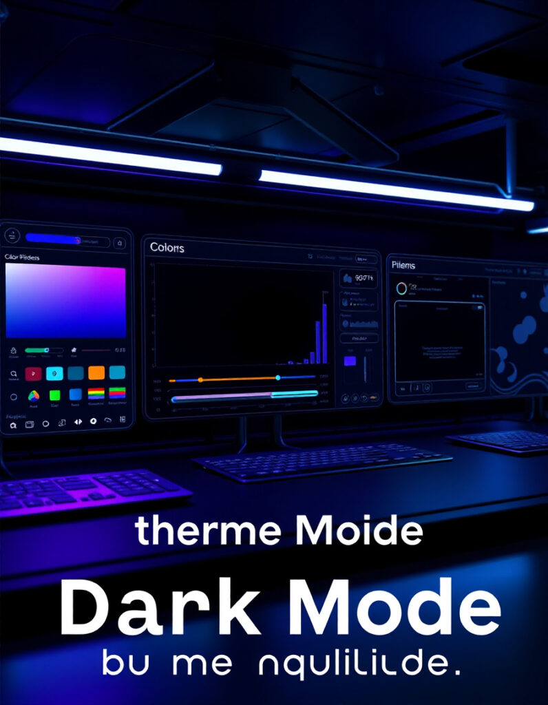
🌙 Dark Mode Theme Builder
Create visually appealing dark mode palettes compatible with your designs.
🧩 Neumorphism Generator
Design soft UI elements and buttons with matching color palettes for modern interfaces.
🔧 Similar Tools
This tool is part of the educational resources published on RideWattly. Results should be used as a reference only and not as professional engineering advice.