Shadow Generator Pro with Layer Groups
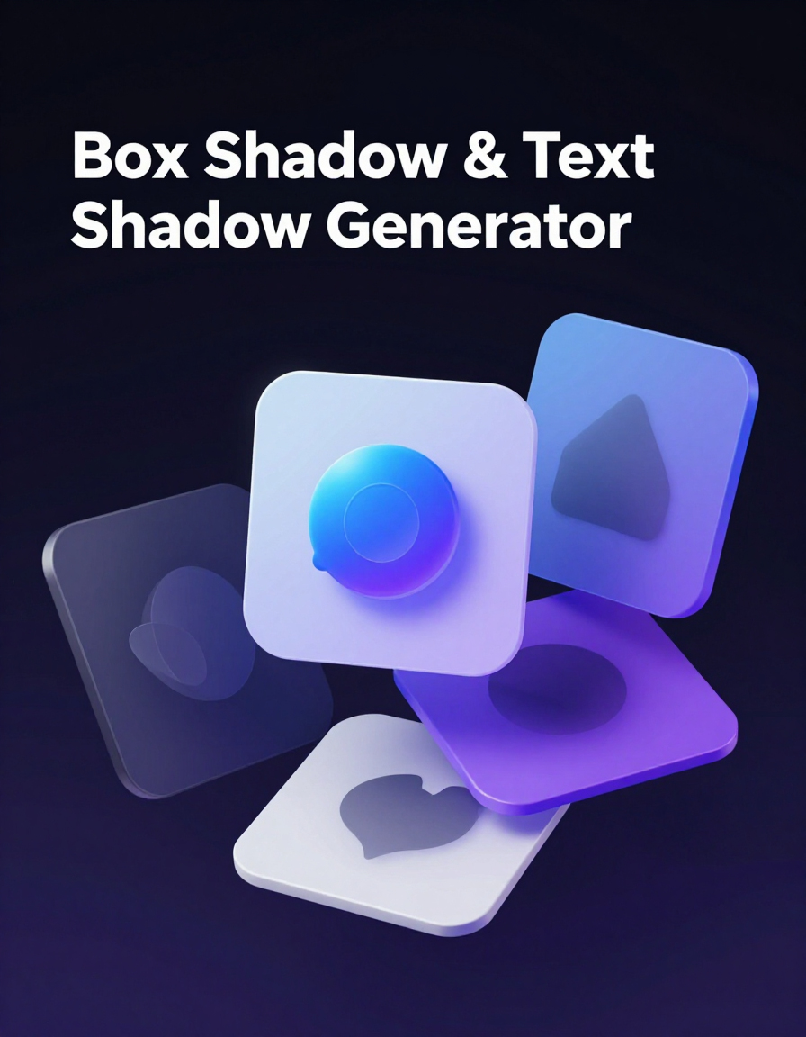
Designing modern user interfaces requires attention to detail, and one of the most powerful visual tools in CSS is the shadow effect. This Advanced CSS Shadow Generator helps you create stunning box-shadow and text-shadow effects with full control and live preview.
Build complex layered shadows using multiple groups, adjust offset, blur, spread, opacity, and color, and instantly see the results in real time. With features like drag & drop layers, design saving, and clean CSS export, this tool is perfect for both beginners and professionals.
Whether you're designing buttons, cards, or typography, this generator ensures your UI looks modern, polished, and visually consistent—without writing complex CSS manually.
How to Use
- Choose between Box Shadow or Text Shadow from the dropdown.
- Enter your preview text in the Text field to see live results.
- Click Add Layer Group to create a new shadow group.
- Add layers inside each group and adjust color, offset, blur, spread, and opacity.
- Drag and reorder layers to build complex shadow effects.
- Use Undo / Redo to refine your design.
- Click Copy CSS to export the final code for your project.
- Optionally, save your design to reuse it later from your personal library.
Tips / Guide
- Use multiple layers with small offsets to create soft, realistic shadows.
- Lower opacity values help achieve modern and subtle UI effects.
- Combine blur and spread carefully to avoid overly harsh shadows.
- Test both light and dark modes to ensure your shadows look good in all themes.
- Save your best designs as presets to speed up future workflows.
Why It Matters
Shadows play a crucial role in modern UI and UX design by adding depth, hierarchy, and visual clarity. Well-designed shadow effects can make interfaces feel more interactive and professional, while poor usage can make designs look flat or outdated. This tool helps you create balanced, clean, and consistent shadow effects without manually writing complex CSS.
Who Should Use This Tool
- Web designers creating modern UI components and layouts.
- Frontend developers looking to generate clean CSS quickly.
- UI/UX designers refining visual depth and hierarchy.
- Freelancers and agencies building websites for clients.
- Anyone who wants to create professional shadow effects without coding from scratch.
Common Mistakes
- Using shadows that are too strong or dark, making the design look heavy and outdated.
- Adding too many layers without purpose, which can reduce clarity instead of improving depth.
- Ignoring opacity and using full solid colors instead of subtle transparency.
- Not testing shadows on different backgrounds (light vs dark mode).
- Using identical shadow settings for all elements, instead of creating visual hierarchy.
Examples / Presets
- Soft UI Shadow: 0px 4px 12px rgba(0,0,0,0.1) – clean and modern for cards.
- Neumorphism Effect: 8px 8px 16px rgba(0,0,0,0.2), -8px -8px 16px rgba(255,255,255,0.7).
- Strong Depth Shadow: 0px 10px 30px rgba(0,0,0,0.3) – great for modals and popups.
- Text Glow Effect: 0px 0px 10px rgba(0,150,255,0.8) – perfect for highlighted text.
- Subtle Button Shadow: 0px 2px 5px rgba(0,0,0,0.15) – ideal for buttons and small elements.
Examples / Presets (Click to Apply)
Saved Designs
Generated CSS
/* CSS will appear here */
FAQs & Tips
-
It helps you visually create CSS box-shadow and text-shadow effects with full control over layers, blur, offset, spread, color, and opacity.
-
Yes, you can create multiple layers inside groups to build complex and realistic shadow effects similar to modern UI design tools.
-
Box-shadow applies shadows to elements like cards and buttons, while text-shadow is used for styling text with glow or depth effects.
-
Yes, you can save your shadow designs locally and load them anytime from your Saved Designs library.
-
Yes, the built-in AI features can generate shadow ideas, improve designs, mix styles, and evolve better results automatically.
-
Yes, you can export your project as a JSON file and import it later to continue working on your designs.
-
Use low opacity, small offsets, and multiple layers with subtle blur values to achieve clean and modern UI shadows.
-
Absolutely — the visual interface makes it easy for beginners, while advanced features allow professionals to fine-tune every detail.
Advanced FAQs & Pro Tips
-
Box-shadow applies to elements like divs, cards, and buttons, while text-shadow affects only text. Box shadows support spread and inset, while text shadows are simpler and lighter.
-
Using multiple layers creates depth and realism. For example, combining soft blur shadows with sharp ones can simulate elevation or glowing effects.
-
Spread controls how much the shadow expands or contracts. Positive values make the shadow larger, while negative values tighten it closer to the element.
-
Use two shadows: one light and one dark, positioned opposite each other. Keep blur high and offsets low for a smooth, soft 3D look.
-
Inset shadows appear inside the element instead of outside. They’re great for creating pressed buttons, input fields, or inner depth effects.
-
This usually happens when blur is too low or opacity is too high. Try increasing blur and lowering opacity for a more natural look.
-
Yes — stack multiple shadows with increasing blur and vibrant colors to simulate glow. This works especially well with text-shadow.
-
In most cases, performance impact is minimal. However, very heavy shadow stacks (10+ layers) may affect rendering on low-end devices.
Similar Tools You May Like

🎨 Advanced Color Palette
Create perfect color combinations to match your shadow and UI designs.

🌈 Gradient Background Generator
Design smooth gradients that work perfectly with shadows and depth effects.
🧩 Neumorphism Generator
Create soft UI designs using layered shadows and subtle depth.

🪟 Glassmorphism Generator
Build modern glass-style UI with blur, transparency, and shadows.
🔘 CSS Button Generator
Create stylish buttons enhanced with shadows, hover effects, and animations.
🟦 Border Radius Playground
Design rounded shapes that work perfectly with shadows and depth.
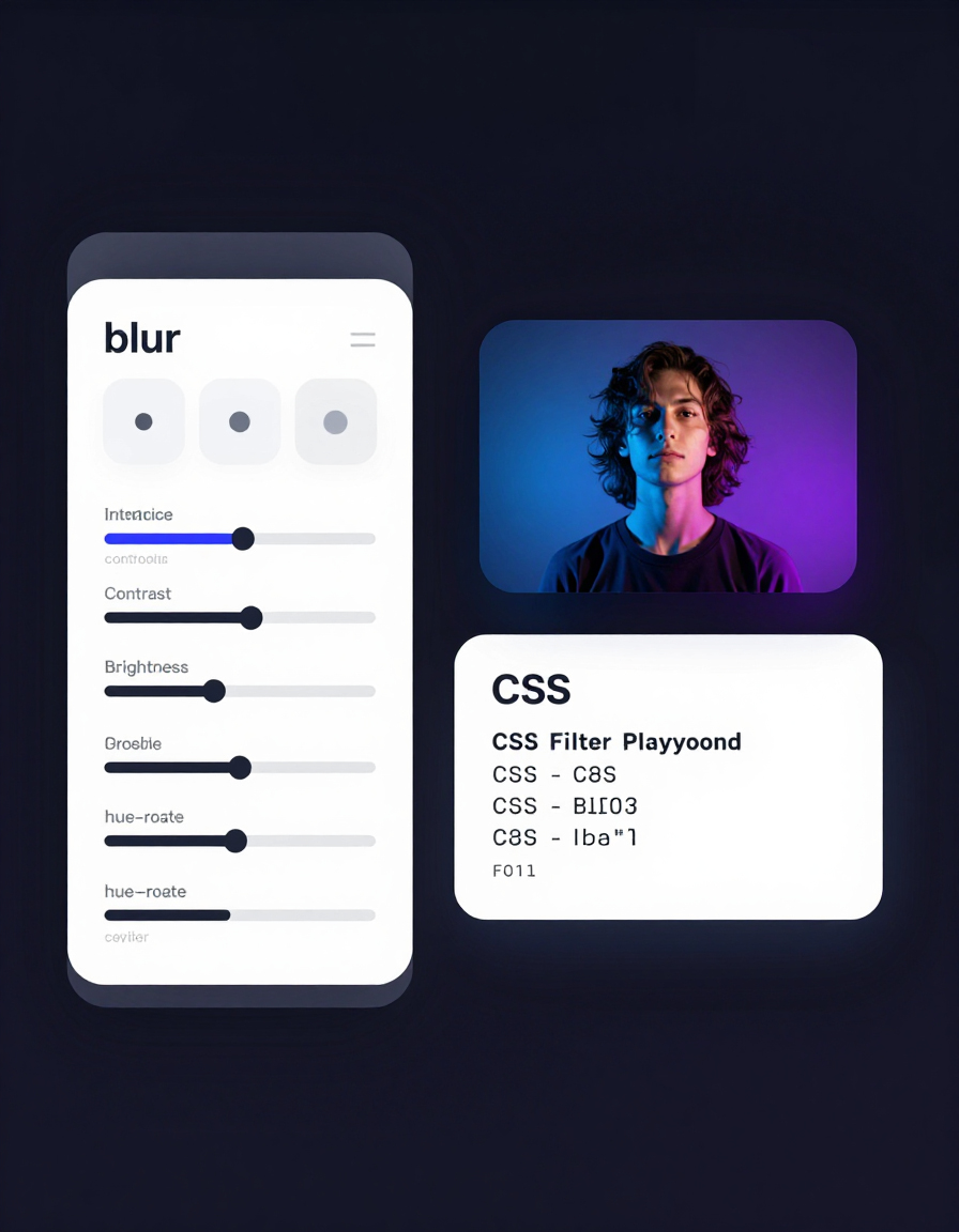
🎨 CSS Filter Playground
Enhance visuals with blur, brightness, and contrast alongside shadows.

🛠️ Interactive CSS Enhancer
Improve and refine your CSS designs with live editing and smart enhancements.
🔧 Similar Tools
This tool is part of the educational resources published on RideWattly. Results should be used as a reference only and not as professional engineering advice.