🔠 Font Size Visual Converter
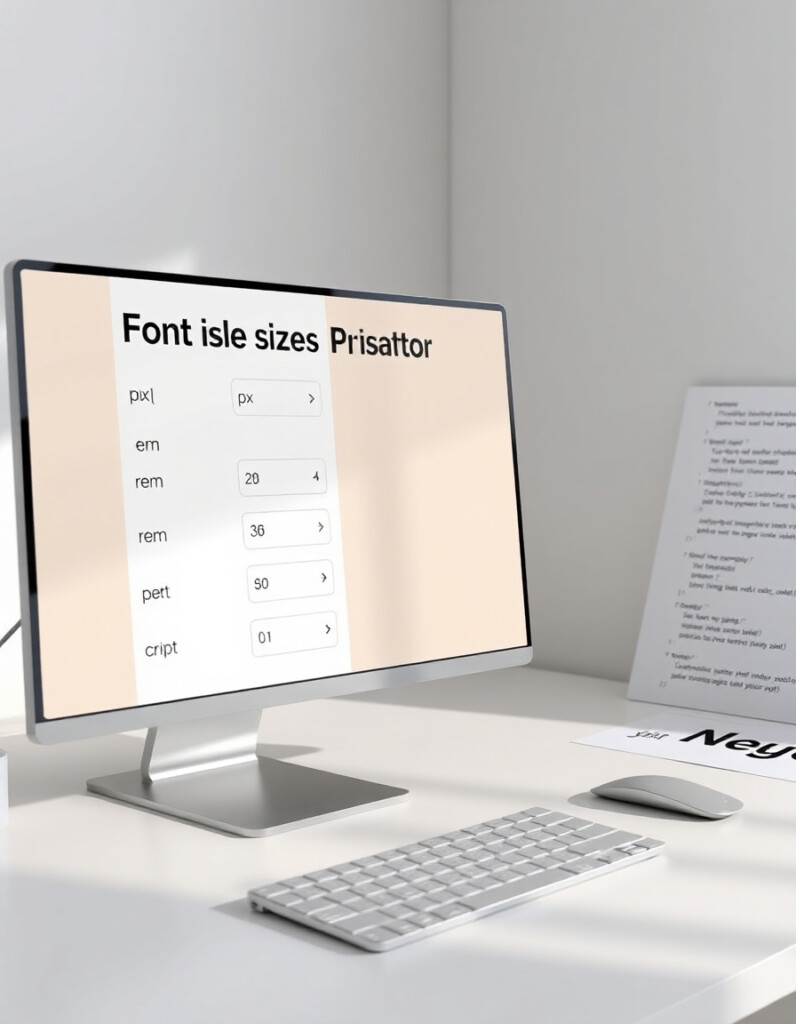
Designing responsive and accessible typography requires a clear understanding of how font sizes translate between px, rem, em, and percent. Using the right units ensures consistency across devices, improves readability, and keeps your design scalable.
RideWattly’s Font Size Visual Converter allows designers, developers, and front-end enthusiasts to instantly preview text scaling, convert between common CSS units, and generate clean, responsive typography values for any project.
Whether you're setting headings, body text, or UI elements, this tool gives you immediate visual feedback and accurate conversion results — helping you maintain perfect harmony in your web typography.
FAQs & Tips
-
It converts font sizes between px, rem, em, and percent while providing an instant visual preview of text scaling.
-
Designers, developers, front-end enthusiasts, and anyone working on responsive typography can use it to ensure consistent and scalable font sizes.
-
Yes, the tool instantly shows equivalent values in px, rem, em, and % for any input value.
-
Absolutely — you can see how the text will look with the converted font size in real-time.
-
Yes, it helps you select units that scale well across devices, making your typography consistent and accessible.
-
Yes, RideWattly provides it freely for web designers, developers, and students.
Advanced FAQs & Pro Tips
-
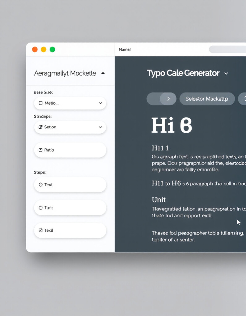
px is absolute pixels, rem is relative to the root font size, em is relative to the parent element's font size, and % scales relative to the parent font size as a percentage.
-
Use rem for consistent scaling across the entire page, and em when you want font sizes to adapt locally within a container.
-
Percentages scale text relative to the parent element, making it flexible, but you need to manage nesting carefully to avoid unexpected sizing.
-
Yes, enter different values to see an instant visual comparison and generate corresponding conversions for each unit.
-
Ensure your base font size is readable (usually 16px), use relative units (rem/em) for scaling, and test across devices for contrast and legibility.
-
Absolutely — it helps convert and preview font sizes according to framework scales, ensuring consistent design and responsive typography.
-
Yes, you can determine base sizes in rem or em for scaling text in different breakpoints, simplifying responsive typography adjustments.
-
Yes, RideWattly provides it freely for designers, developers, and students to experiment with font sizing and responsive layouts.
Related Tools & Resources
🔠 Font Size Converter
Convert and preview font sizes across px, rem, em, and percentages instantly.
🔤 Typography Scale Generator
Create consistent and harmonious font scales for web and UI projects.

📏 Spacing Scale Generator
Generate responsive spacing units to complement your typography and layout.

📐 Grid Builder
Visualize and create flexible grid layouts for responsive designs.

🔘 CSS Button Generator
Create buttons with custom sizes, padding, fonts, and hover effects.
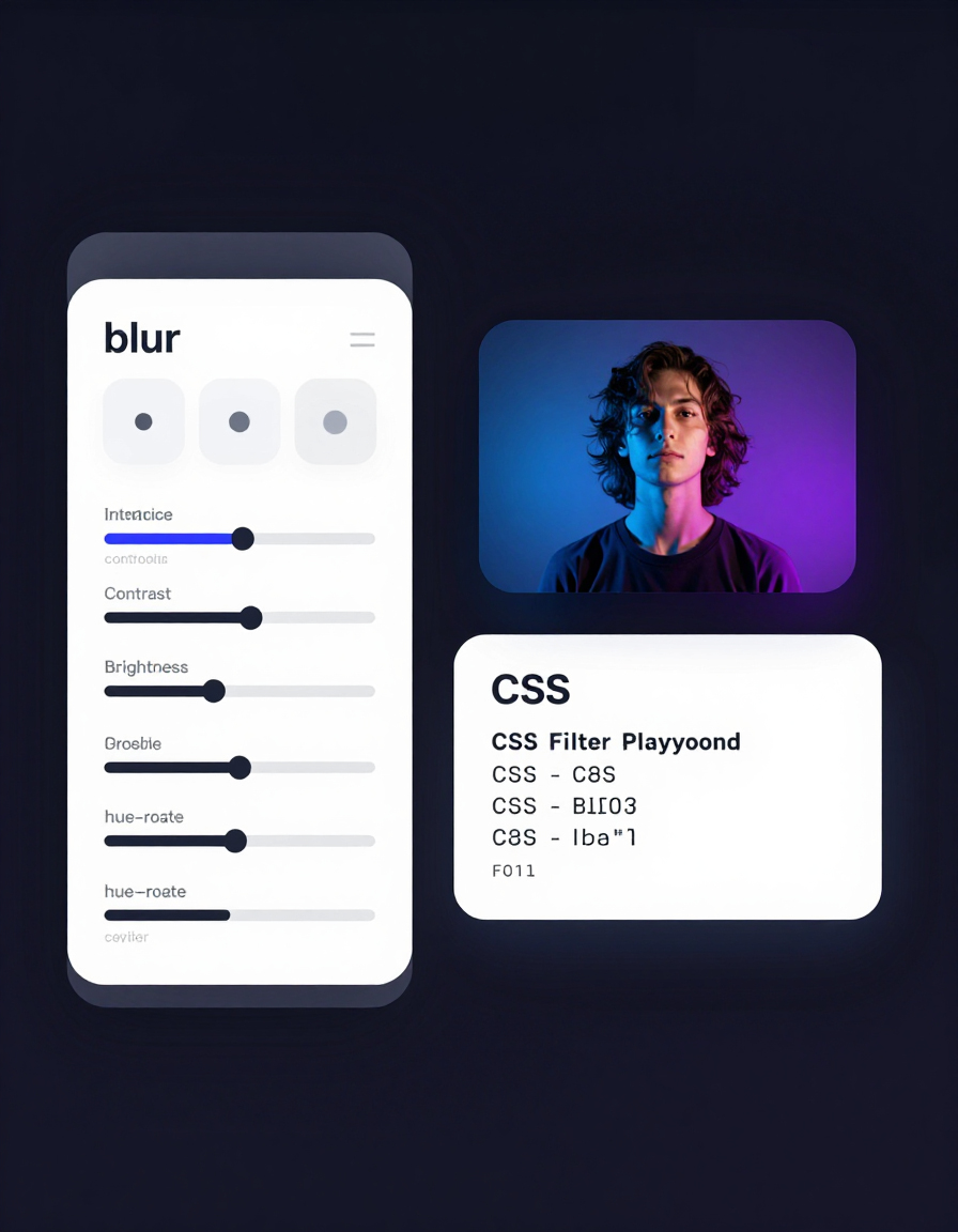
🎨 CSS Filter Playground
Experiment with CSS filters like blur, contrast, brightness, and more in real-time.

🌙 Light-to-Dark CSS Generator
Convert light-themed styles to dark mode quickly and accurately.

🛠️ Interactive CSS Enhancer
Enhance your CSS with interactive effects and live dark/light mode toggles.
🔧 Similar Tools
This tool is part of the educational resources published on RideWattly. Results should be used as a reference only and not as professional engineering advice.