Font Size Unit Converter
Introduction
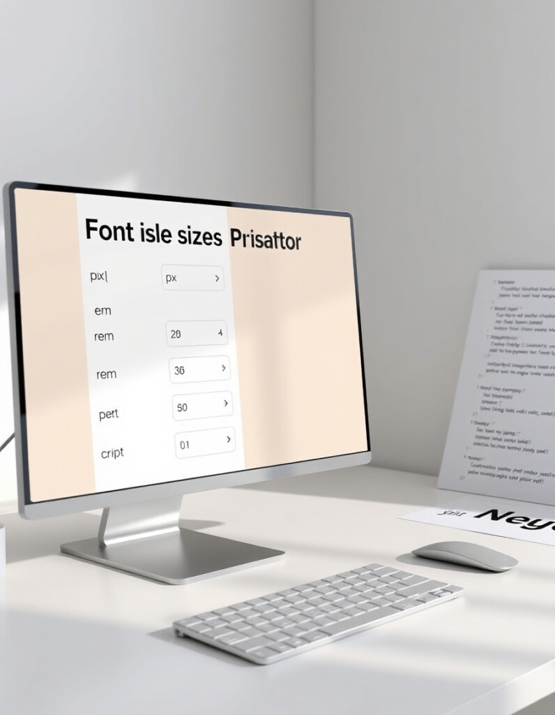
Designers and web developers often deal with multiple font size units — px, em, rem, pt, and %. Switching between them can be confusing and time-consuming. The Font Size Unit Converter makes it easy to convert any font size instantly and maintain perfect consistency across your projects.
What the Font Size Unit Converter Does
This tool converts font sizes between all major units, ensuring your designs look consistent on all screens and devices. Whether you’re coding a website, designing a poster, or creating responsive layouts, the converter gives you accurate size values in real time.
How to Use the Font Size Unit Converter & Why It’s a Must-Have for Designers
How to Use the Tool
- Enter Your Value: Type a font size (e.g., 16px or 1.2em) in the input field.
- Select Units: Choose the unit you want to convert from and to (px → em, rem → pt, etc.).
- View Instant Results: The converter automatically calculates and displays the equivalent value.
- Adjust and Compare: You can tweak your input values to see how font sizes adapt in different units.
- Apply in Design: Copy the converted value and use it in your CSS or design software for consistent typography.
Why You Should Use It
✅ Saves Time: No more manual calculations or confusing formulas.
✅ Improves Consistency: Ensures text looks uniform across screen sizes and platforms.
✅ Perfect for Developers & Designers: Ideal for anyone working with responsive web design.
✅ Accuracy You Can Trust: Uses standard unit conversion formulas based on browser defaults.
✅ Boosts Accessibility: Helps maintain proper scale and readability for all users.
Pro Tip:
Use the converter to standardize your typography system — for example, start with a base font size of 16px = 1rem, and convert all other text elements relative to it for perfect responsive balance.