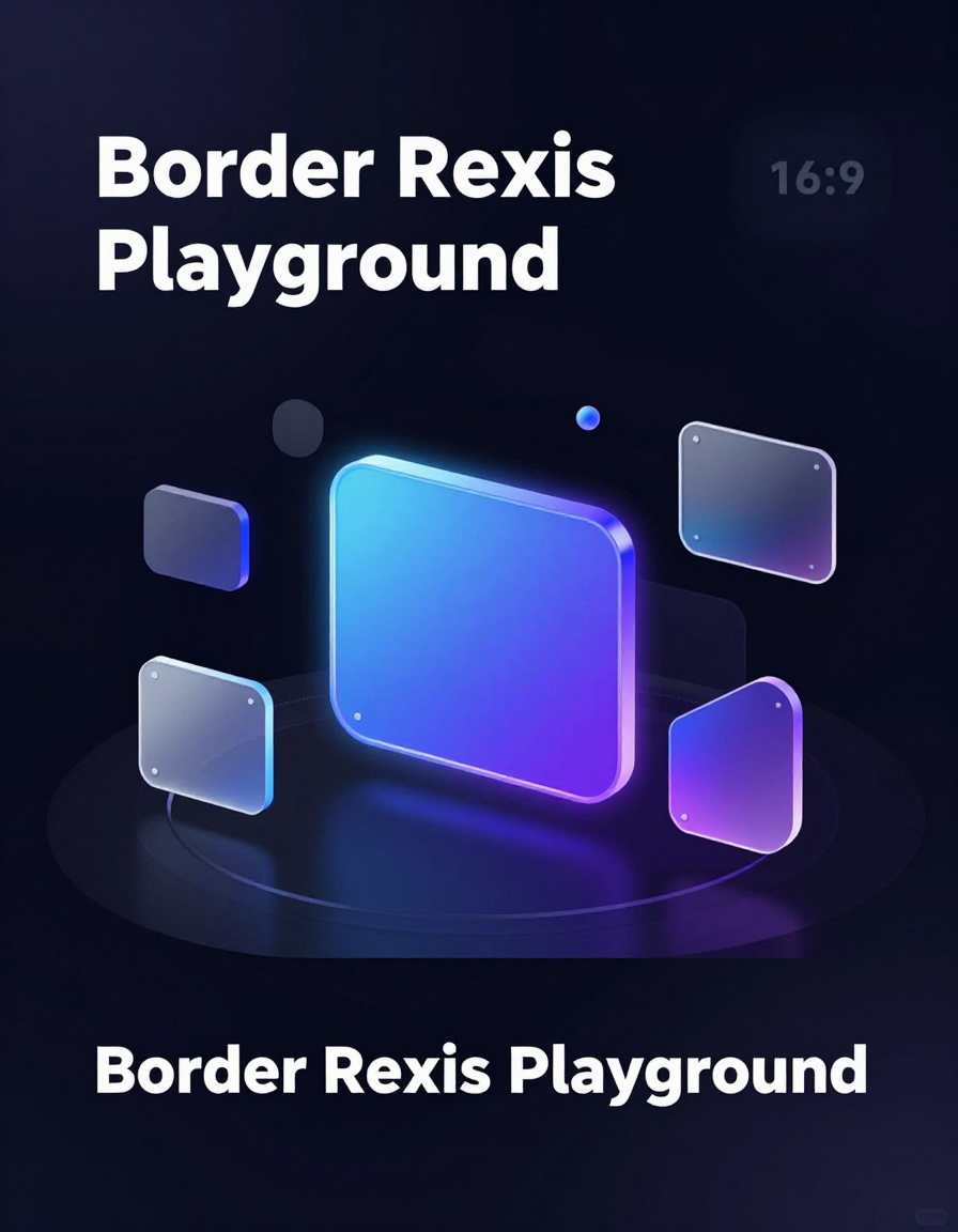
🎨 Border Radius Playground
Create complex, custom border-radius shapes visually without writing CSS.
The Border Radius Playground allows you to adjust each corner individually,
switch between px and %, preview live changes,
and instantly copy production-ready CSS for your web projects.
🔍 Why Use the Border Radius Playground
- Create fully custom shapes with per-corner X/Y control
- Switch between pixels and percentages for responsive layouts
- Preview changes live with smooth transitions, shadows, and gradients
- Copy clean CSS instantly for any project
Whether designing cards, buttons, avatars, or UI elements, this tool removes guesswork and speeds up development.
🛠 How to Use the Tool
- Adjust each corner — top-left, top-right, bottom-right, bottom-left with separate X/Y sliders.
-
Select units — use
pxfor exact control or%for fluid, responsive shapes. - Preview live — see your shape instantly in the central preview box.
- Use presets or randomizer — quickly generate shapes or get inspired with automatic random shapes.
- Copy CSS — click the export box to copy ready-to-use border-radius shorthand.
📊 Who Should Use This Tool
- UI/UX Designers — experiment without writing CSS
- Front-End Developers — generate complex CSS instantly
- Product Designers — preview components before handing to devs
- Students & Beginners — learn how border-radius shorthand works
- Creatives — make fun shapes for illustrations, avatars, icons, and backgrounds
The Border Radius Playground helps you design expressive, pixel-perfect UI elements efficiently,
making it an essential tool in any web designer or developer’s workflow.